
23 Feb Logo design – theory and selection of colors- ARD604
People quickly catch the message that we consciously or unconsciously convey with the color of clothing. It looks exactly the same in the case of advertising, marketing and logo design. Color is of great importance in visual identification because properly selected can join a company to such a group of receipts that will elevate the brand high or which will significantly lower its clarity. Below are the colors along with the description and trademarks of popular brands.
You probably remember the physics of Isaac Newton – the guy who, sitting under the apple tree, discovered gravity? It was he who published the first color wheel that represents the geometric relationship between primary colors and their derivatives. He discovered that by mixing primary colors, red, yellow, and blue, other derivative colors are created. For example, a combination of yellow and red gives orange, red, and blue-violet, and blue and yellow-green.
Discovery of the color wheel, we can also recognize complementary colors, i.e. pairs of colors that complement each other in achromaticity. They are very easy to locate because they lie exactly on opposite sides of the circle.
Color psychology.
Colors have always been with us. We can easily call it the color of money, the color of the sky, and even the color of anger. We love when our lives take on colors. We have our favorite colors and the ones we hate. We dress in colors appropriate to the situation. It’s hard to think about a man in a red suit at a funeral or about two women in long white dresses at one wedding. When we feel good, we surround ourselves with bright colors, and sadness is associated with gray. Color also dictates the interior design. One can venture to say that color rules our lives.
The first is the simplest monochrome palette. It is a set of colors within one color, which is obtained by changing the shade, tone, or tint. The second way may be the selection of adjacent colors, i.e. an analogous palette selected from one part, e.g. a quarter of a color wheel.
The third way, in my opinion, the most effective, which I often use, uses complementary colors. These are eye-catching combinations, sometimes contrasting and dangerous, but definitely eye-catching. The key to correctly using this scheme is a skillful operation between the brightness and intensity of colors, so as not to create too strong and chaotic impressions.
The fourth way will allow us to choose three different colors that can create an interesting design for us. To get colors, divide the circle into 3 equal parts of 120 degrees and choose colors lying in these places. Such triads can be both beautiful and interesting, as well as arousing anxiety, so everything depends on the eye of the designer.
How to use color psychology?
Conduct research and detailed analysis of the target group. You need to know who you are looking for – and who will look for you. Learn age, gender, expectations, and other conditions. Get to know your client and – equally important – your brand. Przemyśl, as well as what it should be associated with, does not choose red for a financial institution, but elegant, silvery gray for a toy store. Use the knowledge of colors for your profit – attract the customer with your eyes. Combine colors – By combining their features you can use their full potential.
Since everything is already known about colors, why not use them? The big business world does it, nothing prevents you from using it in your company. When designing a logo, website graphics, or paper advertising folder, do not bet on random choices, do not be guided by your preferences – use the knowledge of color psychology and make your visual identification a tool for creating profit.
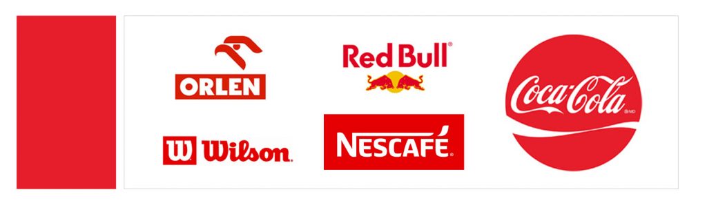
RED -Accelerates the decision, raises the pressure, causes an adrenaline rush. Identified with energy, bravery, love, fire, and sex.
YELLOW– It makes you happy and makes you feel better. It warms up energetically, but in a much milder way than red. Associated with the warmth of the sun, energy, optimistic, and joy of life.
ORANGE– is the effect of a mix of red and yellow, so it combines the features of these two colors. Energetic, like red, and at the same time positive, like yellow. Identified with youthful vigor and warmth.
GREEN-It comes from nature, so it raises soothing peace and a sense of security. Associated with fertility, fertility, and development. It strengthens the sense of credibility and sincerity
BLUE– Shades of blue are associated with water. This, in turn, has overtones of nature, purity, unity with nature. Blue, therefore, symbolizes confidence, stability, and health.
VIOLET– Color associated with submission and negotiation skills. However, he also has a second face – a mist of mystery. Depending on the shade, it can evoke magical and energetic associations, or bring subdued seriousness to mind.
BROWN- A very safe color, associated with nature in its original form – wood. Soothes nerves have a calming effect, inspire trust and confidence. Considered the color of ecology.
GRAY-s king in its class. It is very neutral, it has absolutely no cultural conditions, but psychologically, despite all appearances, it has a great impact on people, it is associated with elegance and formality. Subdued and sophisticated, it brings to mind associations with money and accuracy.
BLACK-Strong, strong and mysterious. It evokes associations with elegance and timeless class. Identified with dignity and higher realms. Although in our culture recognized as the color of mourning, at the same time it is strong support of power and strength.
WHITE– Seemingly neutral, but it has tremendous strength. Its power is determined by purity and clarity. It has the element of mystical spirituality and depth. It blends beautifully with other colors, creating subtle but extremely legible compositions.
Sorry, the comment form is closed at this time.