ARD 608 / 03.05.2022
ARD 608-final show selection

...

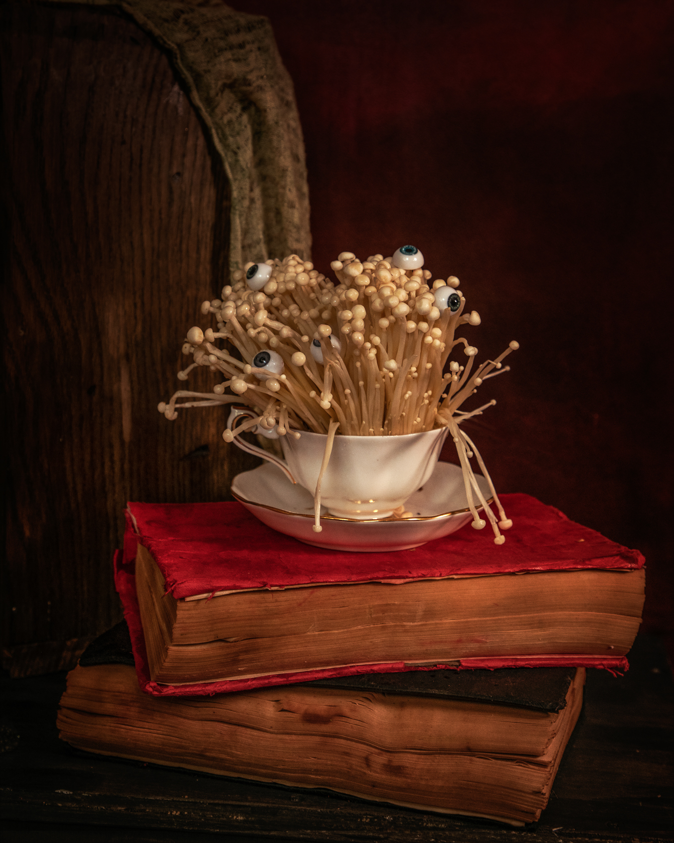
The project I present is a series of still lifes based on food products but immersed in a surreal world. While creating these still life compositions, I focused on keeping them still in the aesthetics of 16th and 17th-century painters, because they give me a sense of peace and order. It is a kind of illusion of controlling chaos. The main assumption was to show the food product as an artistic element of the composition, which is not immediately associated with consumption. I wanted such an element to suggest the philosophical aspects of passing, life, death, and rebirth. I wanted...
My name is Beata Skorek, I am an artist-photographer. I have also been working as a chef for many, many years. Art and cooking are my two great fascinations. As a culinary stylist, photographer and chef, I want to combine my love of art and nature. In all my artistic activities, I want to sensitize the recipient to the beauty of natural products that surround us and that nourish us. I especially like to create still-life compositions inspired by the works of 17th-century Flemish and Dutch brush masters. The captivating realism and almost photographic details of these paintings have always...
After a few hours of consultation with my favorite graphic designer, I received a few suggestions for my logo ...
The latest design trends are, above all, simple but carefully constructed text logos. This type of timeless design requires a deep understanding of your brand identity, attention to detail, and an informed typographic choice. Geometric sans serif | Paid / Free for Mac Design by Adrian Frutiger Developer: Linotype Avenir is classified as a geometric typeface, but it exceeds the strict limits of this term. Typically such typefaces are based on geometric shapes, but in the Avenir font, the letter "o" is not a perfect circle, and the vertical lines are slightly thicker than the horizontal lines, which adds harmony and warmth to this...
Style in European art of the last decade of the nineteenth century and the first twentieth century, included in the framework of modernism. The essence of Art Nouveau was the pursuit of a stylish unity of art by combining activities in its various fields, in particular artistic craftsmanship, interior design, sculpture, and graphics. The characteristic features of the Art Nouveau style are flowing, wavy lines, abstract or floral ornamentation, Japanese art inspirations, free composition arrangements, asymmetry, plane and linear, and subtle pastel colors. Basic features of Art Nouveau are commonly considered to be a characteristic line - flexible, fluid, and...
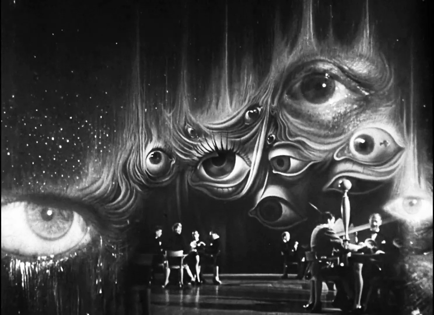
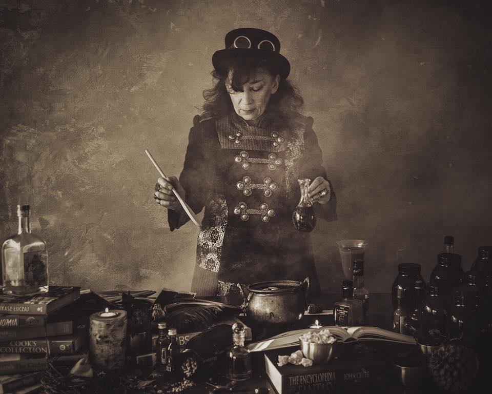
Oneirism (Greek: oneiros "dream dream") - a literary convention consisting in showing reality in the shape of a dream, a dream, sometimes a nightmare. Usually, the work is then irrational, absurd, contrary to the rules of probability. The cause-effect relationships and logical sequences of events are blurring.When Guillaume Apollinaire first used the word "surrealism" in 1917 as a subtitle for a theater play, he probably did not expect that in the near future it would mean something that would have such a huge impact on art history. Even (over) a hundred years later, the surrealists' works are one of the...
What is typography? In a narrower sense, this term usually covers the graphic shaping of the text, using the available typefaces. In a broader sense, the slogan "typography" can also be applied to the design of the layout of illustrations, photos, and other graphic elements in various types of publications. Typography can be divided into two basic areas: macro typography - developing an idea, a comprehensive concept, including not only the arrangement of individual elements within the whole, but also the selection of the format, appropriate font, and colors of the design, paper, and in the case of multi-page publications, also the composition...
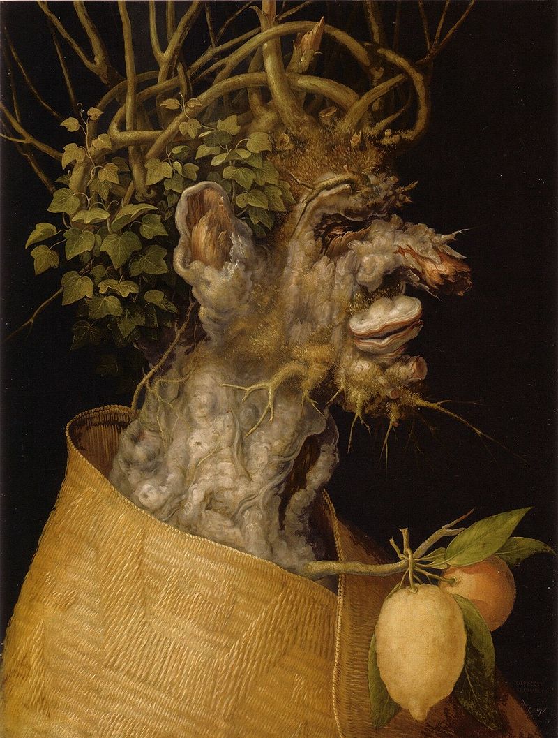
Giuseppe Arcimboldo (1526 or 1527 - 7/11/1593) was an Italian painter best known for creating ingenious portrait heads made entirely of objects such as fruits, vegetables, flowers, fish, and books. These works constitute a separate category from his other productions. He was a conventional court portrait painter for the three Roman emperors in Vienna and Prague, creating also religious themes and, inter alia, a series of color drawings of exotic animals in the imperial menagerie. He specialized in grotesque, symbolic compositions of fruits, animals, landscapes, and various inanimate objects arranged in human forms. The dead portraits were clearly intended in part as...