
10 Oct THE THEORY OF COLORS AND ITS MEANING IN PHOTOGRAPHY-ARD 514/516
When creating a photo, we probably care about its proper exposure and composition. We define the subject of the photo, the distribution of elements, you decide what to put in the frame and what to remove it. Color is just another piece of the puzzle, but extremely important. Editing photos is the final step before showing them. The theory of color and the importance of color in photography is certainly crucial.
Color in artistic terms has been the domain of painting for centuries. Over the years, the knowledge of color developed and the first color schemes were created. Currently, such knowledge is useful not only in painting, photography and film, but also in graphics, fashion, advertising and interior design. The theory of color has been developed over the centuries, and as a result, several color models were created to define colors.
The best known are: RYB in painting, RGB in monitors and color displays, and CMYK in printing.
Through the practical combination of science and art, the theory of color was created. Its job is to identify which colors look good together and are the perfect combination. It determines how the color affects a person, what emotions it evokes in him, how to combine colors so that the image / photo / film / graphic design looks attractive to the human eye.
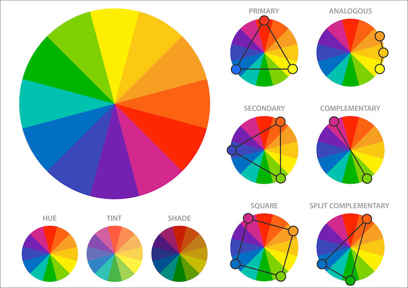
Color theory and the traditional color wheel that functions in the art world were developed by Isaac Newton in 1666. He conducted an experiment based on the diffraction of light through a prism. Thanks to this, he appointed the so-called primary colors and the relationships between them. The color wheel also determines how colors are created by mixing them.
The primary colors are red, yellow and blue (red, yellow, blue – FISH). Derivative, second-order colors were created from the combination of primary colors: yellow and red give orange, red and blue give violet, blue and yellow give green. Mixing the colors of the processions together gives the colors of the third order.
In the RGB (red, green, blue) model, red, green and blue are used as primary colors. Mixing them produces yellow, cyan and magenta. The RGB model is called the additive model, and these colors are used in monitors and other color displays.
The CMYK model recognizes magente, cyan and yellow as the primary colors. Their mixing in subtractive synthesis produces red, blue and green. CMYK colors are used in printing and refer to pigments
The color theory strictly defines individual colors, hence their distribution on the bar wheel is not accidental. Based on this layout, we can distinguish, among others colors:
warm (yellow, orange, red) – they are lively and energizing; cold (green, blue, violet) – they give the impression of coolness, peace.
analogous – these colors lie next to each other on a circle and have similar colors (e.g. yellow, yellow-orange, orange). As a rule, one color is dominant and the other two complement it. Thanks to this, you can get a subtle, harmonious, coherent atmosphere of the photo.
complementary – which lie opposite each other (e.g. red, green) always complement each other and enhance the contrast. The combination of these colors is always well perceived by the human eye. Complementary colors often used in cinematography. The most famous combination is probably teal and orange, which has dominated Hollywood.
monochrome – different shades of the same color, depending on the saturation and brightness
triad based – three colors (e.g. primary) that reinforce each other create a high contrast. The palette based on such colors is lively and dynamic.
.
Sorry, the comment form is closed at this time.