
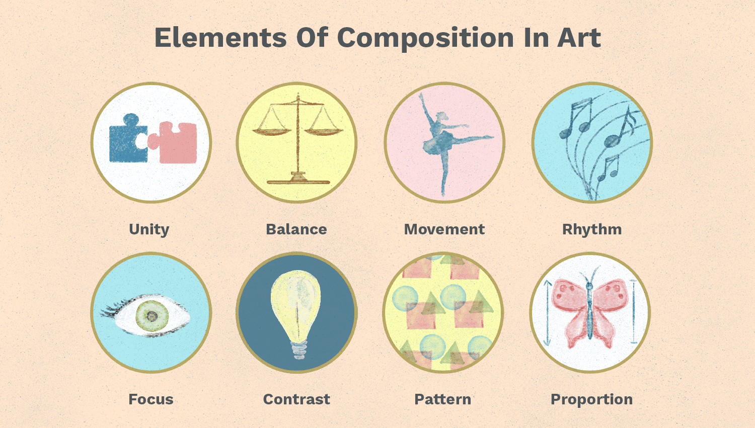
17 Feb ARD517 – composition
The rules of composition in landscape painting and any other, are only a guide on how to paint to make the picture interesting. We don’t always know why we like a given image and it has this “something”. Most often, however, success comes from applying the rules of composition that are worth knowing. Therefore, I present these principles once again in the points:
The main point of the picture
Each scene should have a star that focuses the viewers’ eyes. The rest are supporting and background elements.
- The most important element is emphasized by:
- the strongest color and complementary color
- the greatest color contrast
- people, animals, and the creations of human hands are the most eye-catching
- the main space should not be obscured by anything, even to a small extent
- cannot be in the center of the image (golden ratio)
- background elements should in a way to point to the main element and lead the viewer to it
You should avoid scattering dominant elements in different places of the picture, as they will compete with each other and the viewer will look from one to the other and will not know what to look at.
- Such elements should be combined into one group close to each other.
- The two main objects in the image
- An image may contain two places of interest, but composing them well requires a lot of experience. There is a high risk of error.
- it cannot be one above the other
- one must be greater than the other
- it is best to place them diagonally, as a last resort on a horizontal line.
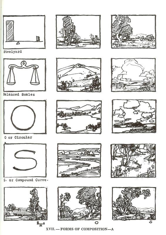
Lines in the image
The viewer’s eyesight goes along the longest and dominant line.
If the line extends to the edge of the image, your eyesight will move beyond the image and the viewer will lose interest.
How to avoid it:
- animals and people should be turned and looking towards the center of the picture
- roads, streams, rivers and all lines should not reach the edge of the picture, they should point to the shore
- if the line reaches the shore, cover its end with something, change its direction, break the line as it were.
- Lines (roads, rivers, streams) should enter the image along with the letter S. Worse with an arc. A straight line should be avoided.
- Do not start lines from the corner of the picture.
- If you do not know where to start the line, it is better to start traditionally from left to right or from the upper left corner, just like reading a book.
Image depth
We are trying to get a three-dimensional image on a two-dimensional surface.
How to do it:
- objects should overlap
- atmospheric perspective – elements should be brighter and colder as you move away. As you get closer, the elements take on warmer colors and darker.
- further elements should be smaller and less sharpened the image should have at least 3 planes: the closest, middle and farthest
- linear perspective
- an interesting effect is the fog which gives the impression of depth
- the closer elements should be contrasting, the further ones should be less and less contrast
Resting place
In the foreground, it is good to create a resting place for the eyes, bright and empty
Some tips on how to improve the image:
- it is good to weaken the corners of the image so that they do not attract attention – they should be darker and less sharpened
- the shade should not be uniform, it is better to add light shades
- to differentiate forms – objects next to each other should not have similar shapes. For example, if the trees have round crowns, the clouds above them cannot be round either.
- for a well-balanced image, avoid a large object in one corner. The image will appear to be tilted as one of the corners will outweigh. To avoid this, add a similar but smaller element on the other side for balance.
- the brush strokes should go towards the center of the painting, not towards the edges
Color Tips:
instead of mixing the paints on the palette, let them mix in the eye of the viewer. If we use 3 colors as a texture for an element, it looks great if, when viewed from a distance, they create a different shade together.
There should be no more than 3 colors in one element. No more than 3 colors should be mixed together.
for the image to be harmonized, it is worth repeating the same colors in different places. An image looks unnatural if an element is painted with one color that does not repeat itself anywhere in the image.
You should not use the same color in the background as in the foreground as it will look as if there are holes in the foreground
cold and warm colors become stronger if they are adjacent to each other
cold colors move closer and warm colors bring you closer
the paint applied thickly gives the impression that the color is lighter
it is not possible to use as many color tones in the picture as in nature. Therefore, in order to get strongly sunlit places, you need to use the contrast, that is, significantly darken the adjacent areas.
It is important not to follow nature blindly. If we paint a picture from a photo or from nature, it is worth slightly improving what we see in nature. For example, if we see two round shrubs next to each other, they will not look good in the image, even though they are in nature.
source:
Sorry, the comment form is closed at this time.